
How is the top insight calculated in the dashboard?
The following are the insights that can be tracked in the dashboard:
Feedback | Reason | Top Insight |
|---|---|---|
Positive (Satisfied) | Accurate and up-to-date. | Accurate |
Organized, clear, and easy to follow. | Organized | |
Thorough and detailed. | Detailed | |
Neutral | None | None |
Negative (Unsatisfied) | Out of date or incorrect. | Incorrect |
Poorly designed or confusing. | Poorly designed | |
Content incomplete. | Incomplete |
To illustrate how the top insight is chosen, we use the screenshot below as an example:
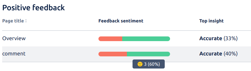
Three out of five users left positive feedback for this page. This makes up 60% of the feedback received. Out of the three users that left positive feedback, 40% gave the same reason: that the content is “Accurate and up to date”.
The rest of the users did not give a reason or chose a different reason that was in the minority.
Thus, the top insight shows Accurate (40%) which is the reason with the highest percentage.